Signs of woe for US stocks
The S&P 500 is testing key 200-day support on Wednesday after slipping to the bottom of its range on the back of a global bout […]
The S&P 500 is testing key 200-day support on Wednesday after slipping to the bottom of its range on the back of a global bout […]
The S&P 500 is testing key 200-day support on Wednesday after slipping to the bottom of its range on the back of a global bout of risk aversion triggered by further declines in the Chinese stock market. However, we have started to notice a few ominous signs closer to home that could make the rest of Q3 and Q4 more difficult terrain for stock investors to navigate.
We think that investors should be watching two charts right now, which could spell a more serious period of unrest for US stocks.
1, US high yield corporate debt
High yield corporate debt is considered a bell weather for investor risk sentiment, so when it starts to show signs of stress, stock investors should take note. The chart below shows the Bloomberg high yield US corporate debt index and the Vix index, a measure of volatility in the S&P 500. This chart has been normalised, and as you can see, these two indices have generally traded in the same direction over the last year.
However, the high yield debt index has accelerated in recent weeks, as investors have charged more to hold the riskiest end of the US corporate debt market, it overtook the Vix in mid-July. The debt index is now at its highest level since December 2014, if this relationship is to hold then we could see further upside for the Vix. This is important for the S&P 500, since the Vix tends to have an inverse correlation with the S&P 500, thus if the Vix rises we may see the S&P 500 come under further downward pressure.
Figure 1:
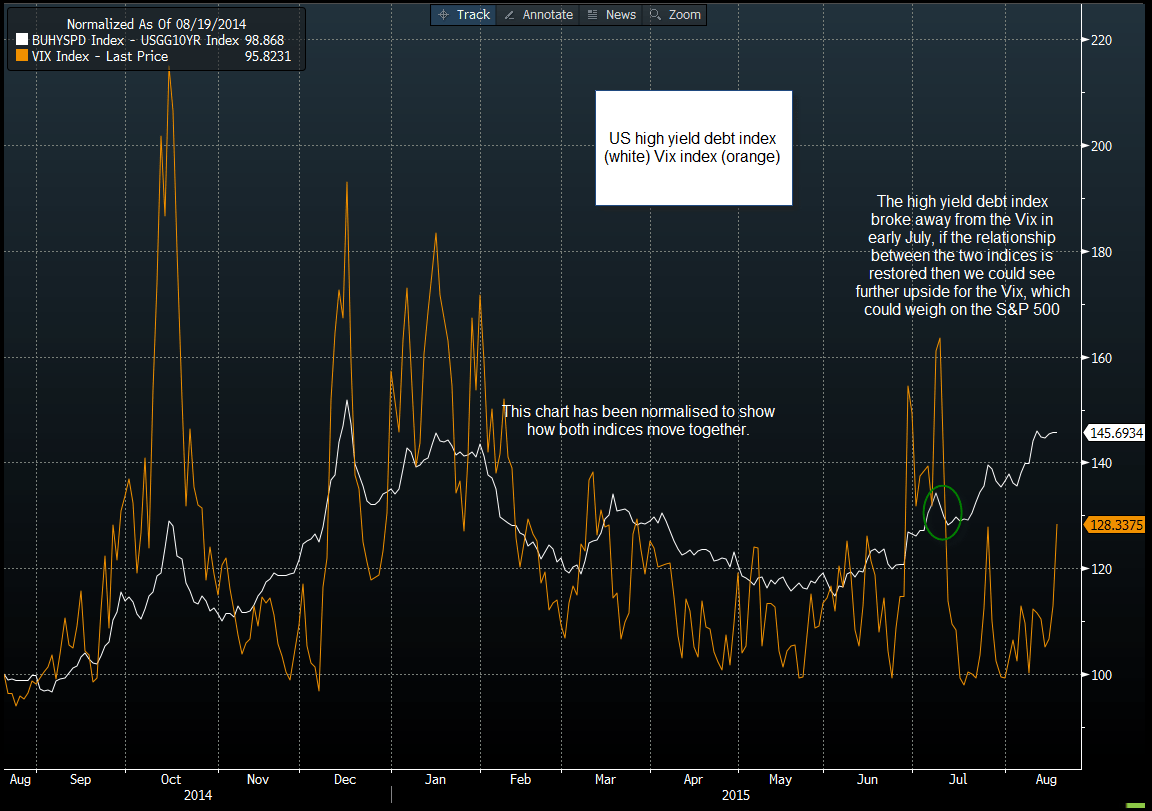
Source: Gain Capital, Data: Bloomberg
2, Apple
The tech giant, and the world’s most valuable company, has seen its share price struggle in recent months after peaking on 28th April, one month since its inception into the Dow Jones. The stock price is now below its 200-day sma and is nearly 15% below its April peak. This matters a lot to the Dow Jones Industrial Average, since this index is weighted according to market capitalisation. This means that when highly valued companies like Apple fall sharply it can have a big downward impact on the index.
Figure 2 shows Apple’s share price alongside the Dow Jones. This chart has been normalised to show how the two move together. There are two things to note about this chart: firstly, the Dow has underperformed Apple since Q4 2014, secondly, since Apple’s sharp slide in July, this has corresponded with a weakening in the overall Dow Index.
To conclude, if Apple’s share price falls into bear market territory (a drop of 20% or more), then we could see further weakness for the Dow, which is already below a cluster of moving average support and is close to its lowest level since February, leaving it technically vulnerable to further losses.
Figure 2:
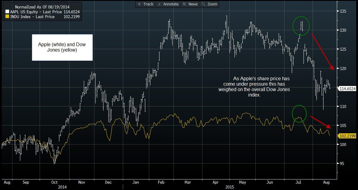
Source: Gain Capital, Data: Bloomberg