


MARKET BRIEF DASHBOARD
The Forex dashboard provides a pulse check on a broad selection of currency markets at a glance. Combining percentage moves with volatility for 20 FX pairs, it allows a trader to quickly assess money flow, sentiment and volatility on a relative basis. Whilst it doesn’t provide trade signals, it can be a valuable tool for a trader at the beginning of their session to help decide which charts to analyse first as part of their daily routine.
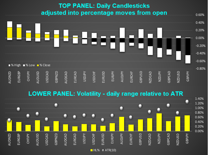
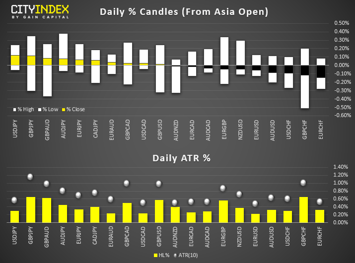
DAILY % CANDLES
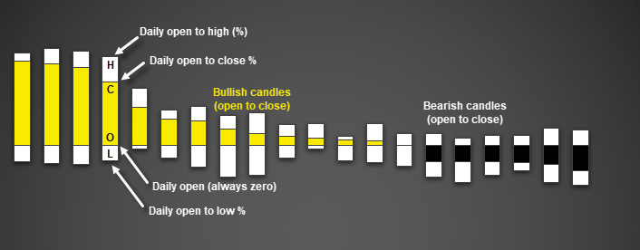
Each bar represents the current, daily candlestick of its respective market. However, it’s expressed in percentage terms as opposed to pips, which allows for an easier comparison between currency pairs. This means that each bar includes an open, high, low and close, just like a Japanese Candlestick or bar chart. Although in this case, the Asian open price is always fixed to zero and the high, low and close show the percentage change from the Asian open.
This allows us to monitor the following:
- Money flow: Currencies are ranked from most bullish to bearish by their open to close %, displayed from left to right. Bullish days will have a yellow body, whereas bearish days will have black. By seeing which currencies appear at the most bullish or bearish end, it allows us to get a feel for currency strength.
- Volatility: Whilst there is a separate section for volatility using ATR, we can compare FX pairs on a relative basis by simply eyeballing how large their daily ranges are. This is no different to analysing the length of a candlestick’s high to low range. Although in this case we can quickly compare 20 pairs to see where the action is.
- Sentiment: During a risk-off session, we’d typically expect traders to shy away from riskier assets such as equities and move into safe-haven assets such as bonds, gold or low yielding currencies. And potential catalysts for risk-off could be a rise in geopolitical tensions or concerns over global growth. Under such scenario’s we’d currencies such as JPY and CHF rise and “riskier” currencies such as AUD and NZD come under pressure. This means we should see carry trades such as AUD/JPY, AUD/CHF, NZDJPY and NZD/CHF trade lower and at the right side of the chart. Conversely, risk-on sessions typically see such pairs lead the session. Furthermore, we can also gauge just how negative sentiment is by how many JPY or CHF pairs dominate the bullish or bearish side, and to what degree the currencies have moved. Obviously, domestic factors will also be at play but over time a trader will get a feel for which pairs are attracting flows and therefore, how strong or weak risk appetite is.
Traders can also apply traditional candlestick analysis to these bars. Just some examples or questions to use include:
- Can we see a series of dojis to represent indecision?
- Has a group of related pairs rallied from the open, display no lower wick and trade at their highs for the session?
- Have we seen pairs begin the session on a strong footing, only to sharply reverse and leave upper wicks whilst trading at the lows of the session?The more pairs we see perform the same pattern, the more information we can glean from sentiment overall.
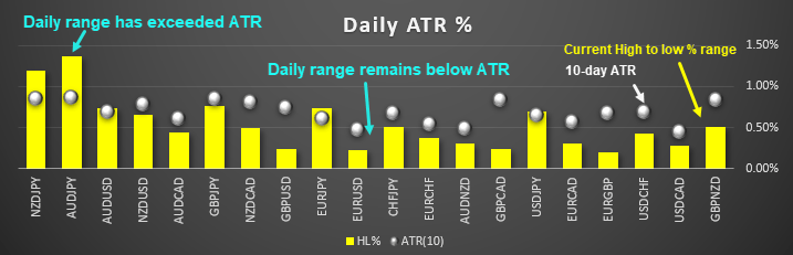
DAILY ATR %
This section directly compares the current daily high to low range against its 10-day ATR (average true range), in percentage terms. Its purpose is to quickly reveal which pairs remain within compression (daily range < ATR) and which have seen range expansion (range > ATR).
- Range expansion: If a pair has met or exceeded its ATR, it could suggest there’s less opportunity to day-trade the pair. That said, it’s still worth pulling up the calendar, news feed and chart to decipher if the driving force is large enough to expect more than a ‘typical’ move (e.g. a shock election result). Alternatively, a trader could use this information to step aside and seek opportunities on pairs that remain below their ATR for intraday traders. Or perhaps a counter-trend trader thinks there’s potential for mean reversion, so seeks to fade the move (trade against the prevailing direction).
- Compression: Pairs that remain below their ATR are potential candidates for intraday traders later in the session. It’s typical to see small ranges for pairs which are yet to be driven by economic data for the day. Whilst there’s no set rule, a trader may want to focus on pairs which have moved less than a third of even a quarter of their ATR. They can then reference the calendar to see if any potential catalyst awaits, before referring to the chart to perform their usual analysis. Of course, sometimes we’ll see narrow ranges on pairs but no news is to be expected. In that case, they may not even hit their ATR by the end of the session. That said, the session you're trading should also be considered. For example, it's more likely to see AUD, JPY or NZD approach their ATRs during the Asia session, if economic data or related news deviates too far from expectations. And GBP and EUR pairs are more likely to be impacted after the UK session has began. And as we approach the end of the US session, the probability of more pairs reaching their ATR increases. So the snapshot we send over near the end of the US session better serves traders in Asia who want a quick look at how markets performed overnight, whilst snapshots sent at the end of Asia are of more use to European traders.
EXAMPLES:
MONEY FLOW AND VOLATILITY ANALYSIS
- AUD and GBP pairs have accounted for the more meaningful moves so far this session. Upon checking the calendar or news, we then see that Australian unemployment fell unexpectedly during the Asian session, which saw AUD strengthen. A trader based in the UK may want to capitalise on this information, but then notes that the AUD pairs have met or are near their typical daily ranges. They could then choose to step aside from AUD pairs (as they may have missed the best part of the move) or check their charts to see if they want to fade against the move, as they anticipate mean reversion. On a side note, AUD/JPY has not yet met its typical daily range. Given its sensitivity to risk appetite, the trader decides to keep an eye on AUD/JPY for further gains if indices trade higher, as this could signify that risk-appetite is broadly spread and not limited to domestic factors from Australia and/or Japan.
- GBP pairs on the other hand are trading lower for the session but have not yet reached their typical daily range. Upon checking the news, a trader notes that headlines from the UK are unfavourable for the pound and their analysis suggests GBP is heavily overbought on the daily chart. They could then refer to their own strategy to capitalise on potential mean reversion, as they expect the British pound to weaken further.
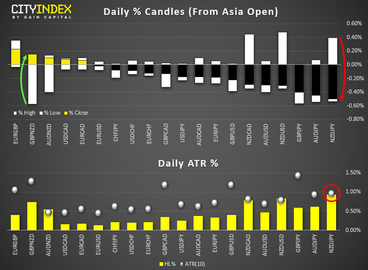
RISK APPETITE
- Near the end of the Asia session (and ahead of UK open) we note a few crosses have reversed their direction since the Asian open, which leaves potential for reversal candles such as hammers or key reversals to form by market close. As the daily range for NZD/JPY has met its ATR, it may be less appealing for intraday trading – but we note it could be on track for a bearish engulfing / key reversal on the daily chart, so is worth another look after market close.
- GBP/NZD is on track to form a hammer pattern, although this also depends the underlying trend. Either way a trader may want to pull up the chart for further analysis. We also note its daily range is only around 50% of its ATR, which leaves potential ‘meat on the bone’ for further volatility as the session progresses.
- As most reversals include AUD and NZD pairs, it suggests domestic news and / or trade related headlines have seen these pairs reverse.
- Three of the biggest losers of the session involves Yen inflows, which in turn suggests it’s a risk-off session. We could explore this further by seeing if indices and bond yields have fallen and / or gold has risen. If we find it’s restricted to FX, then it may well be related domestic news. Either way, it brings out attention to which pairs to look at first as part of our own analysis.
INDECISION DAYS:
At a glance we can see that dojis (indecision candles) have formed across the board, with a series of long wicks above and below narrow-ranged bodies. Additionally, we know they’re relatively small-ranged dojis as all pairs are below their typical daily ranges.
This scenario tends to occur in two ways:
- Markets are waiting for some major news or event (central bank meeting, election, NFP etc). In which case traders may opt to step aside and refer to their calendar before deciding when or which pair to trade after their own analysis
- There’s no news or it’s a public holiday. Upon checking the calendar we see there’s no known catalyst just around the corner, which means we’d typically expect smaller moves for the session without an unexpected catalyst occurring. This can help aid with realistic profit objectives for day traders.
Latest market news
Today 01:15 PM
Today 07:49 AM
Latest Forex articles

Today 04:24 AM
Yesterday 10:48 PM
Yesterday 12:00 PM