2014 The FTSE 100 in numbers
It’s been another very interesting year for the FTSE 100 and individual stocks. Investors have had to get used to the idea of a hawkish change in […]
It’s been another very interesting year for the FTSE 100 and individual stocks. Investors have had to get used to the idea of a hawkish change in […]
It’s been another very interesting year for the FTSE 100 and individual stocks. Investors have had to get used to the idea of a hawkish change in monetary policy from both the US Federal Reserve and (progressively) the Bank of England. The ECB is fighting against deflation within the euro area and now looks set to announce further QE style stimulus to reignite the fledgling euro economy whilst at the same time, a dramatic drop in the price of oil has hurt oil producers. Closer to home, a structural sector decline driven by intense an price war and food price deflation has hurt many UK supermarkets (and that’s even before Tesco’s accounting errors).
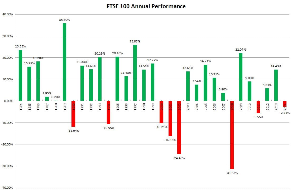
As you can see, the FTSE 100 actually finished the year DOWN, by 2.71%, its first annual loss since 2011 and its 8th annual loss in the last 31 years. Interestingly its the weakest annual loss the FTSE 100 has suffered over the past three decades and were it not for a dreadful start to trading in December, the FTSE 100 would have actually finished in positive territory.
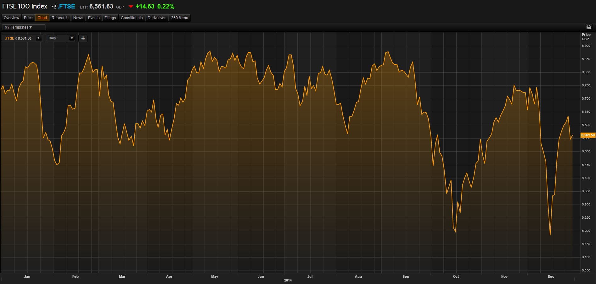
Here’s a chart of the FTSE 100 in 2014
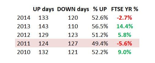
In fact, the FTSE 100 enjoyed a mere 133 UP days (finished the session with gains) compared to 120 DOWN days.
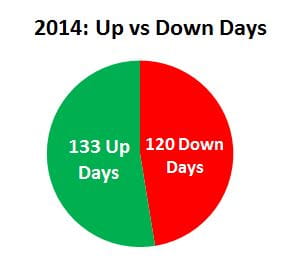
But whilst this may in fact look fairly weak, if you look at the last 4 years, its broadly in line. In fact, aside from last years terrific +14% FTSE annual performance, we saw more positive days this year than in both 2012 and 2010, where the FTSE gained 5.8% and 9% respectively. So there only major thing to read into this is the fact that there were some big losing days that secured the FTSE’s fate this year.
Here’s a list of the top winners and losers within the FTSE 100:

But this won’t actually tell the true story about which stocks were actually driving the FTSE 100′s performance in the year. To do that, take a look at the heat map below. As you can see, it was in fact HSBC and BP which both drove the biggest falls in the FTSE 100. HSBC fell -8% in the year whilst BP fell -16% and because both firms have a whopping market cap of $181bn and $115bn respectively, this provided a large drag on the FTSE throughout the year. British American Tobacco, Astrazeneca and SABMiller all gave the FTSE some much needed energy throughout 2014.

The heat map is a good reminder to those traders of the FTSE 100 and what actually impacts the index’s performance. Yes whilst Dixon’s Carphone was the best performing stock, rallying more than 68% for the year, the reality is this had a minor effect on the way the FTSE traded. Below you will see a pie chart of how each sector is weighted. As you can see, its Financials which maintains the largest weighting on the UK index (21.18%) followed by Oil and Gas (18.49% and Consumer Goods (17.32%).